
About
Hey Hi! I'm Ashish, 24yr old Designer who combines research, rapid prototyping, interaction and visual design to transform complex problems into elegant solutions.

UI/UX Designer & Web Developer.
- Birthday: 10 May 1997
- Website:
- Phone: +91 9762558458
- City: Nashik, India
- Age: 24
- Degree: Bachelor
- Email: ashishbhamare12345@gmail.com
- Freelance: Available
I really thinks everything we do is designed, whether we're producing a magazine, a website, or a bridge. Design is really the creative invention that designs everything.
Other than that Things that really makes me happy:
Family, friends, food, biking, traveling and games.
Skills
Without sharpen your skills; standing on the battlefield would not increase your chance of winning. So since long time i am working on developing the skills required for this sector and utilising the same as a freelancer Designer.
Resume
My Main objective is to get challenging and creative position in organisation where i can utilize my current skills and at the same time polish them by working with the best in the industry.
Summary
Ashish Bhamare
Innovative and deadline-driven product Designer with 2+ years of experience in designing and developing different automated products with initial concept to final, polished deliverable. Also into developing skills for the web and mobile app design and working as a freelancer designer
- Nashik, Maharashtra
- 9762558458
- ashishbhamare12345@gmail.com
Education
Bachelors in mechanical Engineering & Product Design
2015 - 2018
Saghavi Collage Of Engineering Nashik
Completed my bachelor degree with Pune University with first class.
Diploma in Mechanical Engineering
2012 - 2015
L.G.G Polytechnic, Nashik
Completed diploma in Mechanical Engineering with MSBTE University with first class.
Professional Experience
Project Engineer/Design Lead
2020 - Present
Jyoti Display, Gonde, Nashik
- Lead in the design, development, and implementation of the customer requirements into design upto sample Development.
- Distribute tasks to the 6 members of the design team and 9 members of production team counsel on all aspects of the project.
- Supervise the assessment of all Design in production and assembly in order to ensure quality and accuracy of the design
- Estimate the total costing of the project
- Coordination with the end customer for Design verification and project limitations.
- To present the Design and manufacturing plan of the project to end customer.
Jr. Design Engineer
2018 - 2019
Vibha Corporation Nashik
- Design different types of control panel as per the customer requirements.
- preparation of 2d drawings of design parts in 3d software
- Inspect the manufacturing of the product as per design
- Almost Created 25+ design of automated control panel with the help of seniors
Portfolio
The goal of user interface design is to make the user's interaction as simple, beautiful and efficient as possible, in terms of accomplishing user goals. You can find my UI designs below. My developed website designs you can find in Devloped section.
1. Netflix Landing Page Concept Design
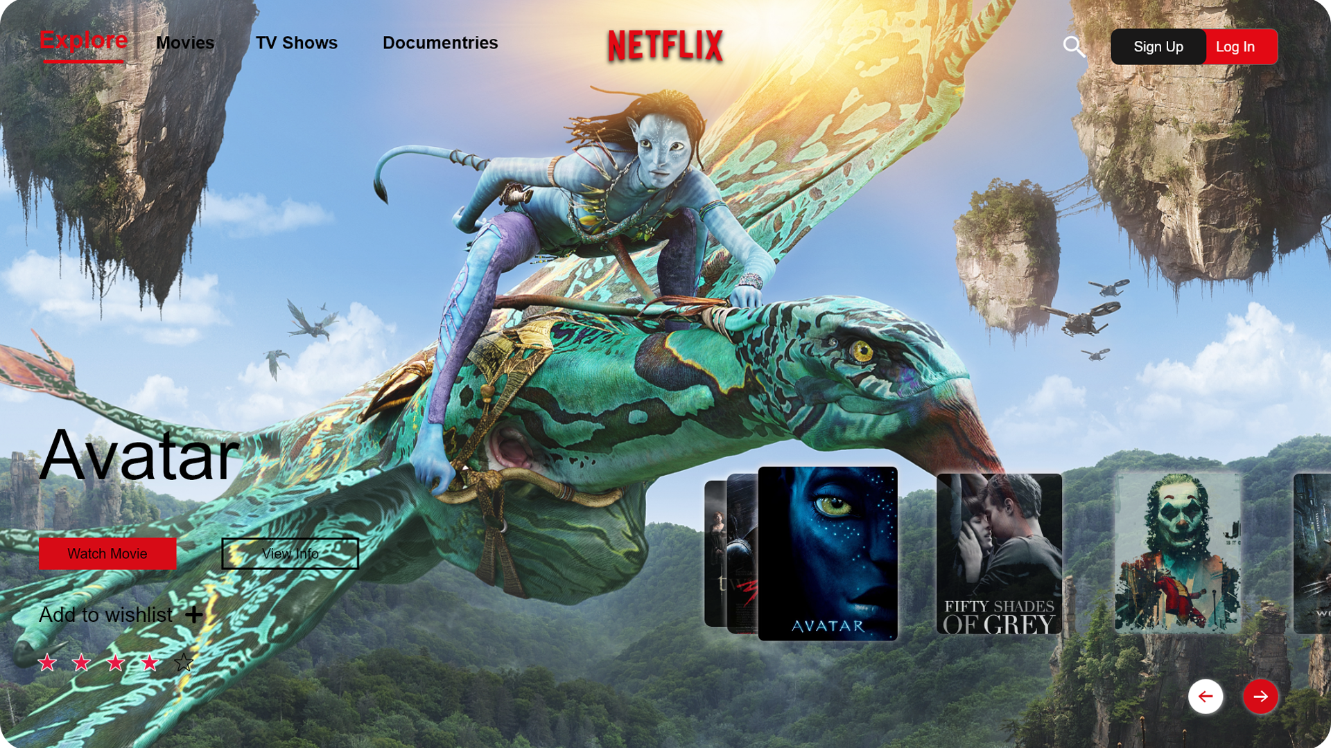
Overview: Netflix is on the Biggest Online Movie Platform which penetrating in India very fast. Founders of Netflix, Reed Hastings, and Mark Randolph started with an idea of using the internet to rent movies on DVD. Also, Netflix is with a subscriber base more than a third of Internet traffic. The company operates on a subscription-based model. Access is given to the user via a monthly subscription plan. With a presence in over 190 countries, Users can instantly watch movies, TV shows. According to Wikipedia, Netflix has 154 Million users Worldwide(total) and 148 Million Paid users. So good landing page plays really important role in atrracting audience Netflix already have wonderful Landing page, i really tried to make it little more intresting concept for Netflix or another similar platform
Case Study: According to Showtrackr, Since landing pages are usually built for specific business purposes like getting more users, subscribers or more product purchases, their effectiveness hugely relies on design.
Most important elements of a successful landing page:
1) Have only one and clear conversion goal (e.g. getting a new user)
2) Make sure every element of your page supports this conversion goal.
3) There is one CTA (call-to-action) button always visible, so the user can decide any time to use it.
Our brain has huge impact of what our eyes see, same concept is used in this landing page that is to create excitement about the movies or other TV show as well as about the app.This type of landing page can directly connect with the audience beacuse you will directly enter into that particular movie or TV show world in the landing page itself. Just like the instagram feed which really excite people beacuse of its way of presenting content,audience will love to explore this website too. The operating is also pretty simple that you can easily scroll to explore the page and watch particular movie or TV show directly by clicking on watch now button.
Watch actual operating in Video below.
Takeaways: This challenge was an excellent opportunity to think more deeply about landing pages and experiment with different decisions that go into such details
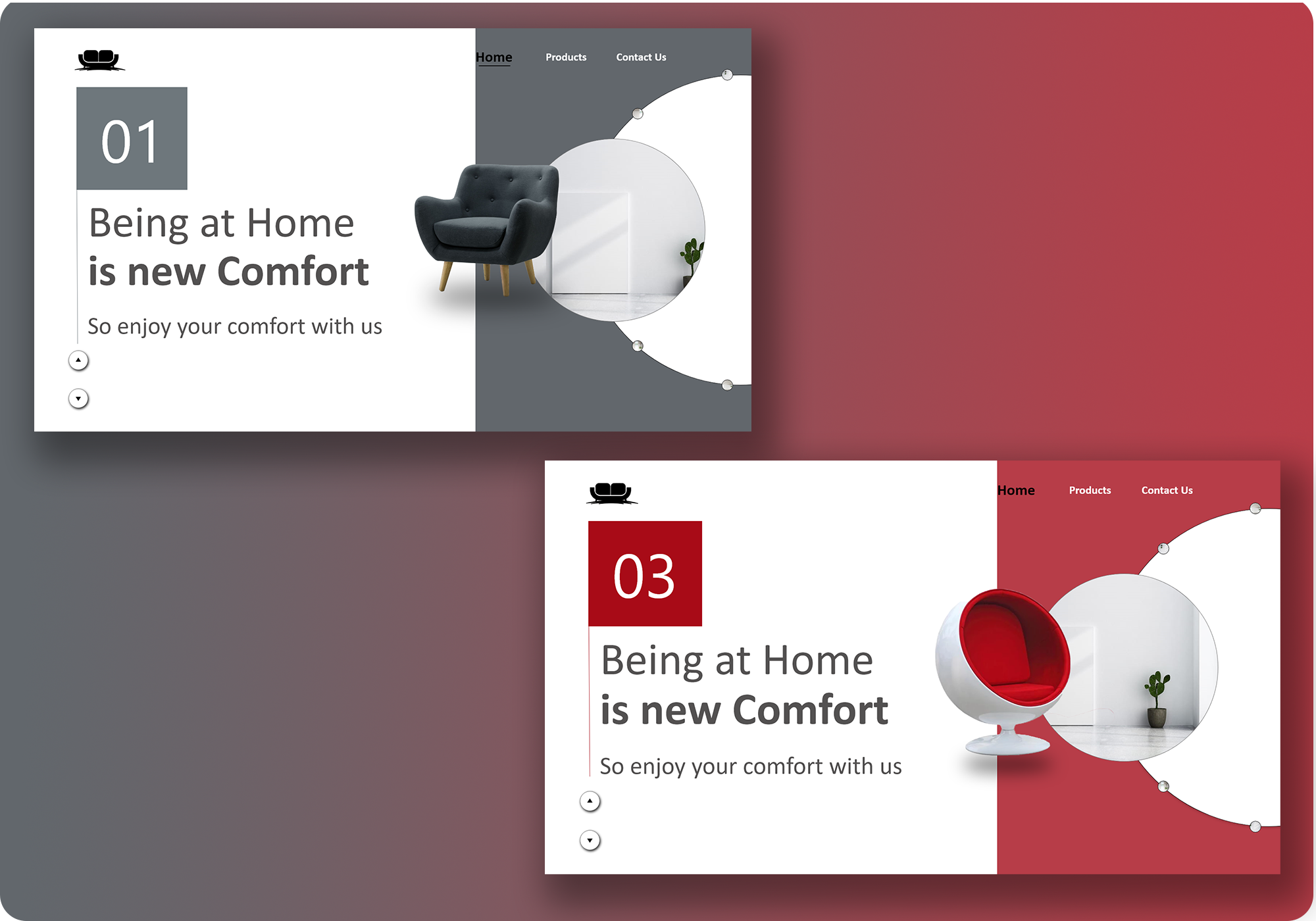
2. Home Decor Interactive Web page Design
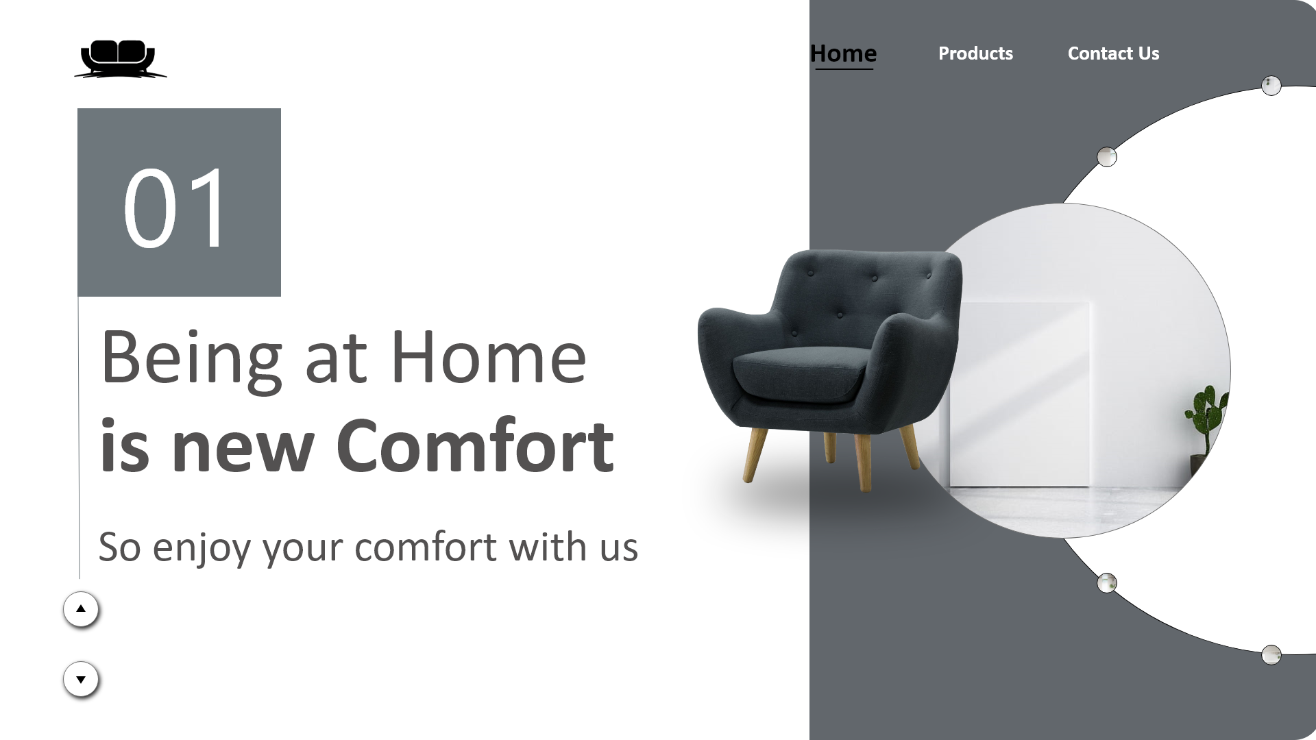
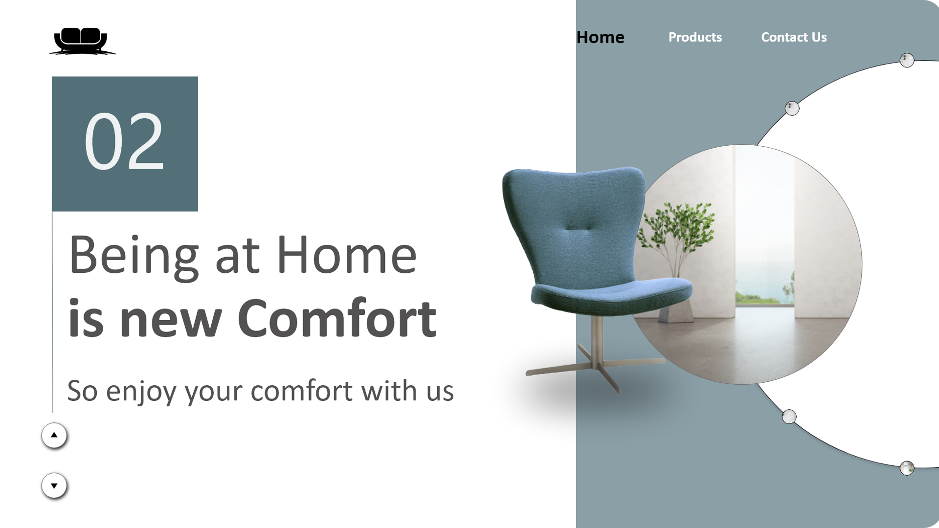
Case Study: For a website like home decor Page design is the essential aspect of landing page elements. Have a clean design that does not confuse your visitors. For the best design,
• Limit the calls to action in your design and make it clear and simple to undertake
• Make the form appear as professional and credible as possible by including awards and testimonials from customers.
• Present your best products at landing page will really atrract visitors.
• Use simple images that tell people what lies behind the landing page.
Use simple words which are clear and easy to understand. Do not clutter your page with unnecessary words to eliminate distraction, confusion or overwhelming your visitors.
I really tried to present the best premium products in the landing page by giving little presentation in the right, so that it will create curiosity about the other product too. little hovering effect of the rooms behind the product adds some extra magic in exploring the page. By clicking down and Up clicks at the bottom left you can scroll into different products in the landing page iitself. Which will excite visitor to read or to know little bit more about the product, mainly about the price and specification. Rest all the interface and fonts kept pretty simple so that entire focus will be on the products.
The interactivness is also enhaced by the revolving cycle at the right which revolves and introduce visitor to the new product with new area of rooms, each time user click to the next or Previous button. Which can directly bring attention of the user towards the prouct.
Watch actual operating in Video below.
Takeaways: This challenge was an excellent opportunity to think more deeply about the product presentation and thier introduction in landing pages and experiment with different decisions that go into such details.
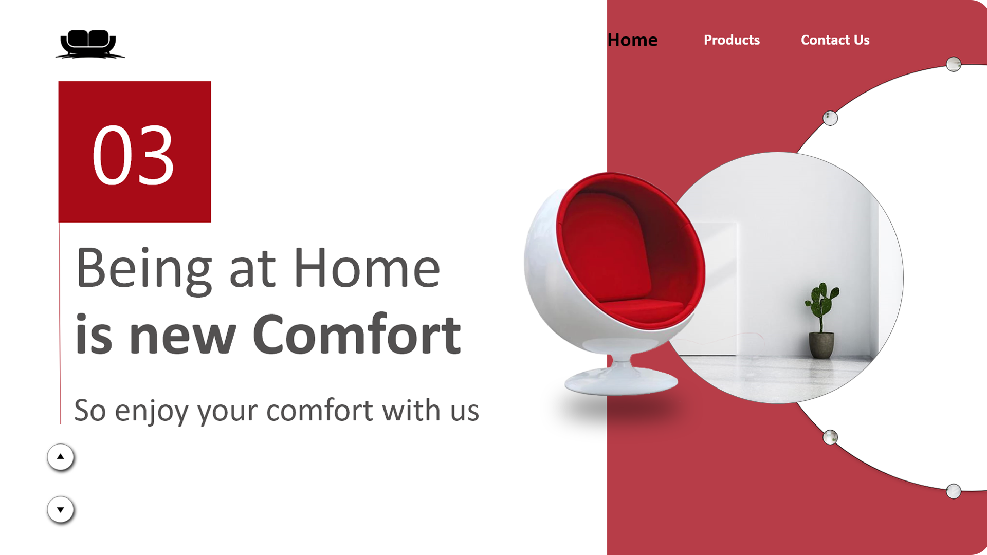
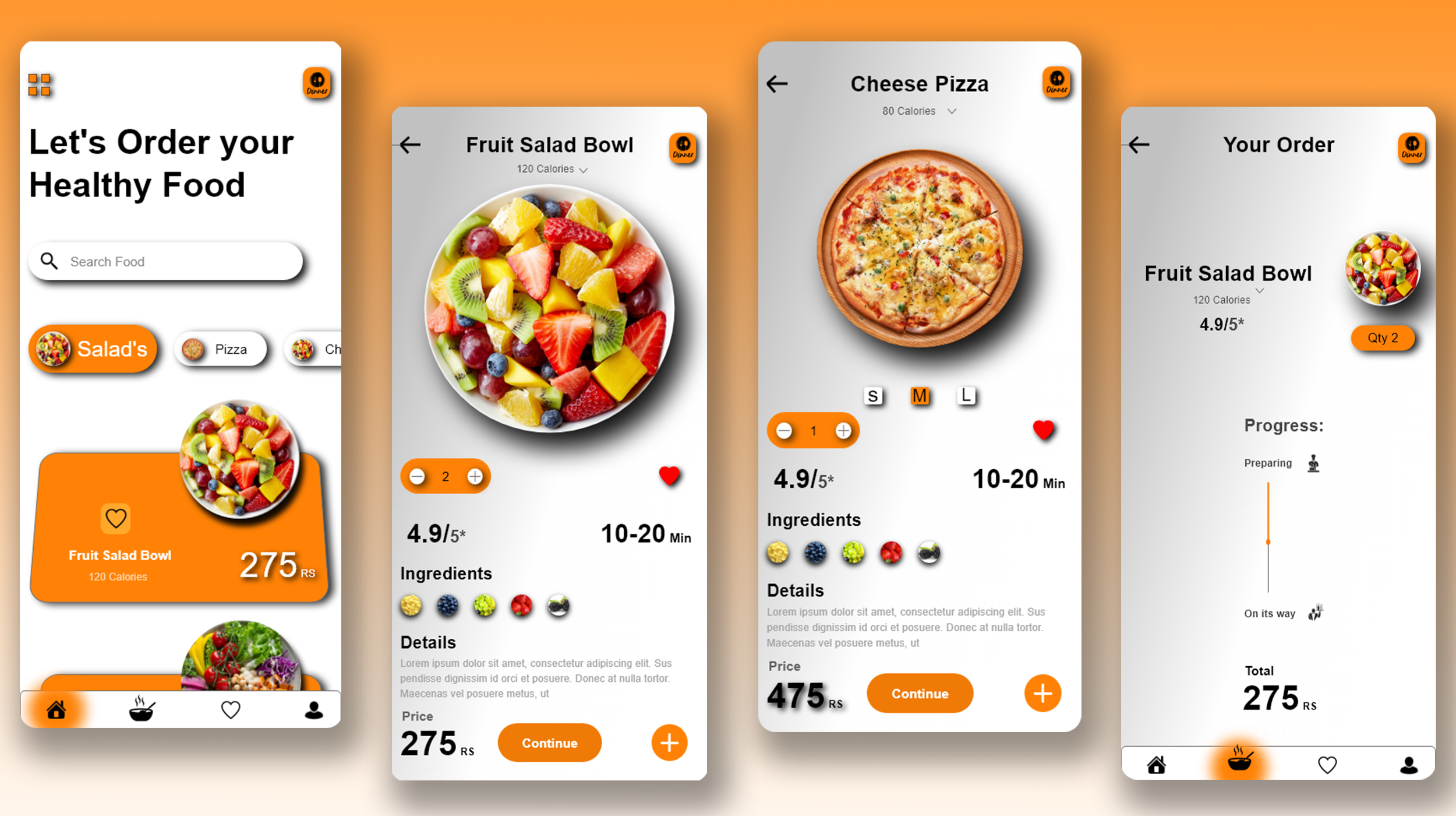
3. Restaurant Landing and Order Page Concept Design
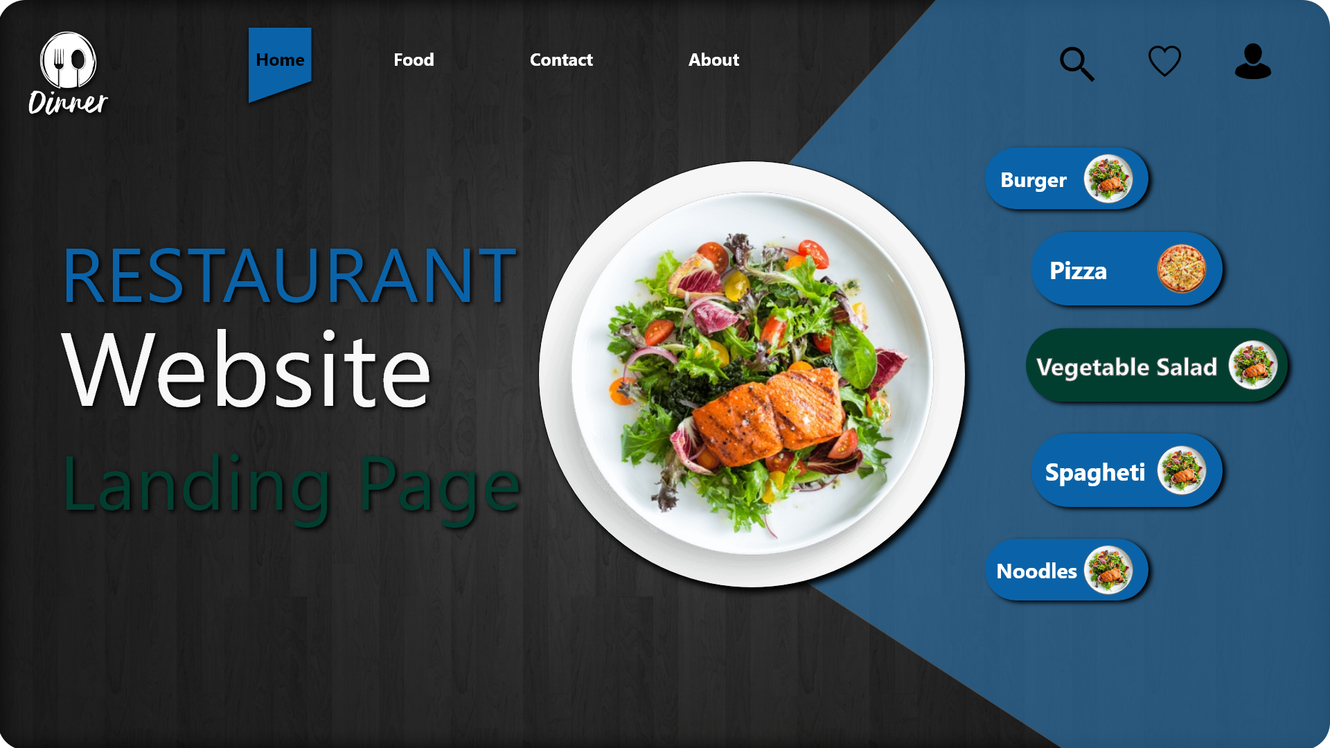
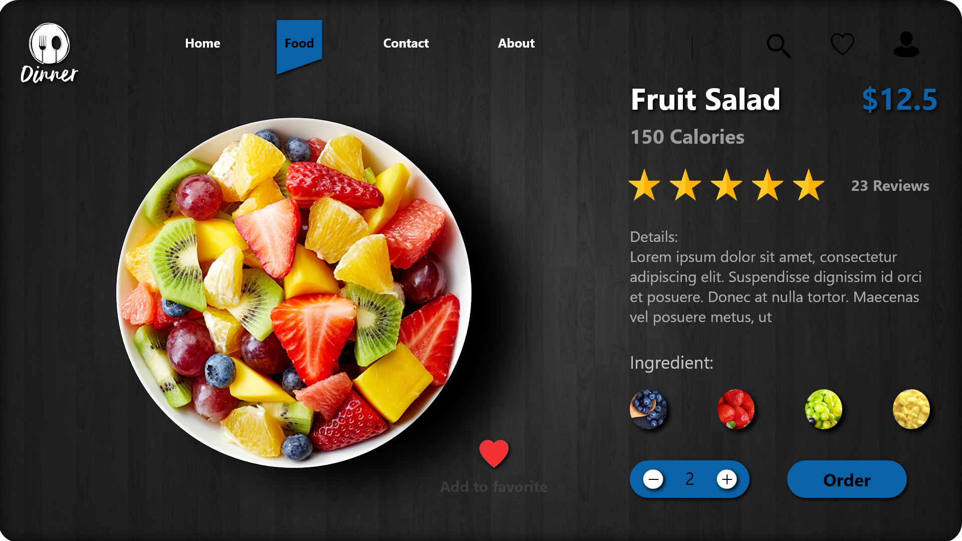
Case Study: This time i took a task to make a landing page design for the restaurant . High resolution images are used in the page for better presentation. I started off with articulating the idea/layout of the website to ensure that the needed information were made present in the landing page and for it to fulfill it’s purpose (on-boarding customers). I started by getting inspirations from platforms like pinterest.com (check moodboard) , dribbble.com etc so I have a view/insight of what I am expected to design. I then began to make wireframes to convey the early ideas I had about the website. When that was done I moved over to selecting a base font, primary color, secondary color and accent color that would bring the restaurant brand perception to the customers.
The hero section was designed by fully paying attention to detail of the categories of the food or special items in the restaurant to enhance user experience and the overall user interface of the section. A special call to action to “the categories” was adopted to facilitate users who would want to view the restaurants menu on getting to the website.
Restaurant that provides catering services and various cuisines ranging from African,American to Asian and the likes. and the place where Satisfaction of customers is paramount for a such the website (landing page) was well designed to replicate the brand persona.
This section was designed to be very pleasing and inviting as this is where the major call to action of the web page dwelt while keeping user experience in mind. There was a section designed where users could choose the specific type of cuisine they are interested in and when served with the available dishes. You can directly tap on the categories to scroll into the food, which also add some interactivness in the website
The order page is also kept pretty simple yet attractive with the help of high quality food iamges that can really grab the attention of the customer. The calorie count is present which can really helpful for the health concious peoples to track thier calorie intake. You can watch the details of the food that you have ordered in the details section (ingredint details, detail calorie details, procedure etc). ingredient section is also kept with images to make user experience more realistic and lastly the order button is kept more bold and focused as to meet ultimate goal of customer that is to order food.
As this page is for restaurant it can be used by both customer and the staff for taking the order which can increase the level of sevice at any restaurant, we can also provide some QR code system in the restaurant which can help customer to jump on the landing page directly for ordering food.
Watch actual operating in Video below.
Takeaways: This challenge was an excellent opportunity to think that how the simple interface also can be atrrative with the help of high quality and presentable images.
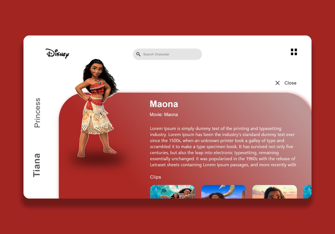
4. Disney Character introduction Webpage Design
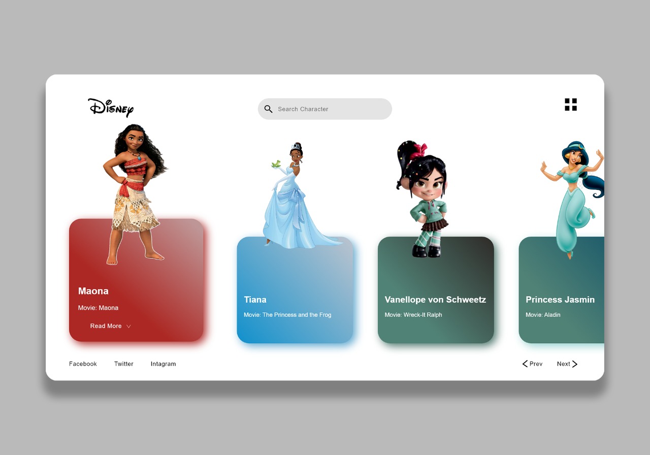
Case Study:This website is specially for the children’s with age group between 3yrs to 13yrs.
Humans are mentally stimulated by a number of factors, and this is especially true with children. Successful children’s websites implement a number of elements and design principles that create an environment suited for a child’s personality and interests.
Bright colors will easily capture and hold a child’s attention for long periods of time. Although color choice is a primary factor in designing any type of website, this is especially true when designing a website for children since colors make a big impression on children’s young minds. So i keep the character background little colorful which matches the color of character it highlights the block totally.
Kids will remember and return to a website if their experience is a happy one. So i tried to give little 3D look to the characters to keep them more interactive and lively with the childrens.
Large, animated, speaking characters are a fascinating and captivating way to grab and hold a child’s attention. So i use this element effectively so that they can watch the characters in the first page and really watch thier stories or can hear from thier parents directly just by tapping on character.
The clips section also added in the informational page so that they can really enjoy a roller coster ride of that character easily and get inspire.
The first page can be redesigned also with some matching graphics with the character at the back instead of plane white background.
Takeaways: This challenge was an excellent opportunity to learn about children’s way of thinking and thier lifestyle.
1. Grocery app UI Design
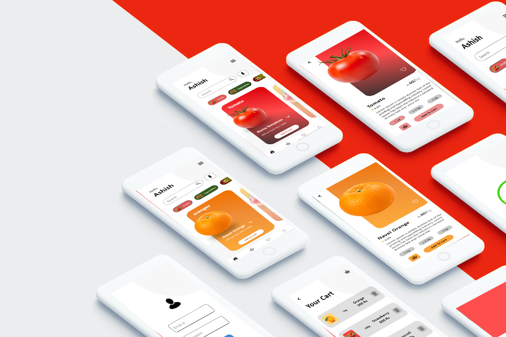
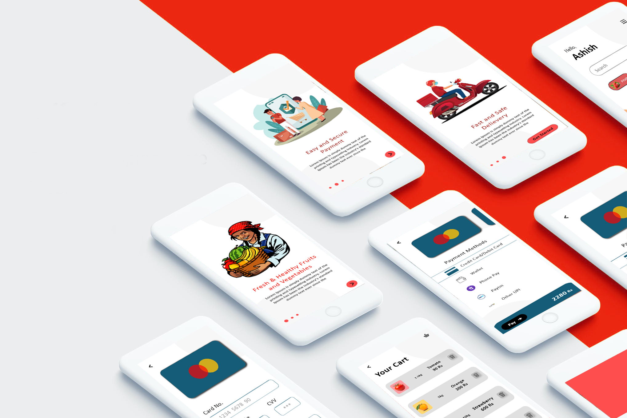
challenge: A create a mobile app that provides dealers with accessible, customized grocery shopping experiences based on different categories
Approach: Current online grocery shopping methods support the needs of customers with unique dietary needs, This app is for the dealers across for organic products directly from the farm.
Goals: 1) Identify potential target users for a new online grocery shopping product; learn their motivations, needs, and attitudes about grocery shopping
2)Identify challenges and frustrations that people encounter in grocery shopping, both in person and online, as well as opportunity areas for improving the shopping experience
3)Design a research-informed solution that addresses people’s specific needs and goals for a satisfactory grocery shopping experience, with a focus on clear interaction design and user interface design
4)Identify and design the desired branding for the new product to enhance the user experience
Design Brief:
There are a number of online grocery shopping platforms on the market which aim to provide busy people with a time-saving, cost-effective way to purchase the groceries they want. However, online grocery shopping products often take away customers’ ability to select their own fresh produce, and many online grocery services do not adequately support people with very specific dietary needs. For example, customers with gluten allergies, vegan customers, paleo customers, and customers who only purchase local organic produce are often unable to find exactly what they need when trying to buy groceries online. This project sought to address these challenges by proposing a research-informed grocery shopping experience for specific dietary needs.
I synthesized research findings to develop a matrix comparing business needs against customer needs. In order for the business to meet customer needs, it would need to provide a time-saving, wallet-friendly way to purchase fresh, high-quality foods and ingredients, and to adequately meet customers’ unique needs, especially customers looking for culturally specific foods, allergen-safe products, and affordable local items. Many people are willing to try online grocery shopping, so long as online options meet their specific dietary needs, their budgets, and their ethical values.
in the usability testing i personally found that any age group can use this app so i kept the interface very simple and easy to use so that elder people also can easily book thier favorite fruits or vegetables. The categories are very less that's why i kept the product pretty presentive so that anyone can easily slide and see the avail product and add to the cart with required quantity. The active offer to that particular product is also mentioned below the categories of the product so that can be used by customer to increase the quantity of the product for getting better offers.
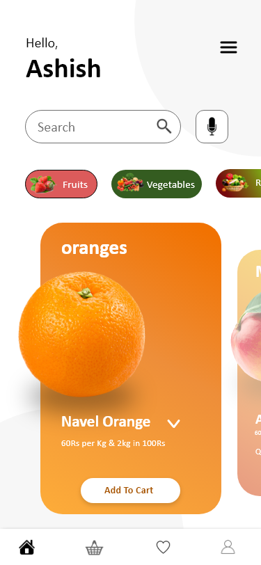

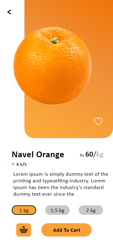
Background of every boxes of avail product is matched with the product gradient so that product will be highlighted. The operating of the app is also very simple you just have to tap on the product and it will take you to the description slide, you can set quantity in that slide and add product to the cart directly, you also have access to the cart from that slide incase you have to withdraw your order. All the details of the product you can read in the details section i.e. Calorie count, its birth, its authenticity etc. You can review and add product to your favourite list from the same slide.
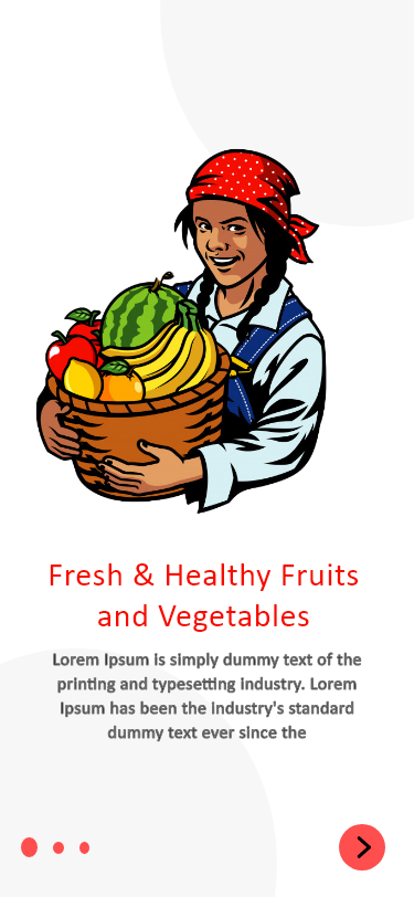
Tried to explain the full working process of the system in three walkthrough slides at the start of the app with some illustration art.
Usability testing revealed that potential users would be interested in seeing the product focus more on customized shopping experiences for users who have specific dietary preferences.
This case study represents the start of a bigger design process for the development of this online grocery shopping experience. It would be necessary to conduct additional usability testing with multiple user flows in order to better understand how people engage with the product, identify more features to improve, and design an even more user-friendly product.
The implementation of additional features would increase the value of the product for prospective customers, and strengthen Seedling’s reputability as a product that is both uniquely considerate of customer needs and efficient.
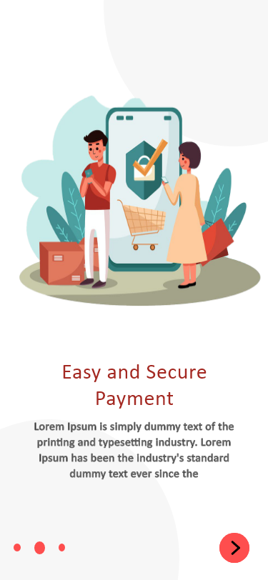
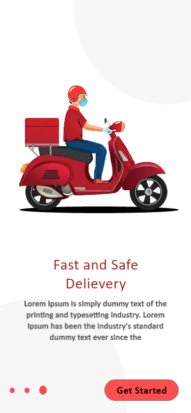
2. Restaurant / Food order App UI Design
Case Study:The restaurant mobile app is a very convenient solution for eating joints, diners and classic restaurants to reach out to their customers, display their menus and specials for the day and at the same time interact with their existing customers.
The restaurant mobile app is especially built for customers who simply love the convenience of making reservations before they arrive at a restaurant. It also displays the menu so that customers know what’s on the specials and what is being served at the restaurant. It’s simply very easy to get orders delivered from their favourite restaurants too.
Restaurants are highly local businesses and in order to increase their customer base, there are very
limited options and avenues. Client wanted to explore digital options for growing the customer base.
Restaurant mobile application was a very apt solution for a local restaurant and it offered to increase revenues by offering a digital channel to reach out to customers. Customers could order food, make reservations as well as avail various options to reach their favourite restaurants.
So i tried to design UI for the restaurant app with good interface, good quality food images and easy usability. The tracking of the food is also there to track customer about thier order. The UX of the app is kept pretty simple so that anyone can use it with ease to order food.


Testimonials
From last two years i have been working with many senior colleagues this they have to say about my work.
Hardworking and passionate guy very dedicated about his work and he really likes to finish his work within time. It was really good experience working with him.
Rahul Chaoudhary
Design manager @; Vibha Corporation
One day i just brief him about my upcoming start-up very next day he come with an exciting idea about the how should our app look like. He gave me presentation about his idea and i am so convince that we are going to use same design for that start up. That really shows his passion and curiosity about learning new things.
Jiban Dutta
MD Jyoti Display
Dedicated guy.He loves to think smart way and he is really a team player.
Bhushan Pagare
Designer Vibha Corporation
He is my senior at the recent project we work together for Mumbai local, have to say this that he is the best senior i ever worked with, really a good explainer, he always has own way to look at the things and solve the problem. All the best sir.